Starbucks Brazil: Improving Usability for Pickup App
As the Experience Lead, I was tasked with spearheading the implementation of new features for the Starbucks Brazil app, overseeing a team of UX/UI designer, developers and product team. Our mission was to transform the app into a powerful tool for enhancing customer experience, driving sales, and increasing membership engagement.
Client: Starbucks
Year: 2022
Problem Statement
The initial version of the Starbucks app in Brazil, while functional, failed to fully engage users, resulting in low transaction frequency, a high rate of inactive members, and an overall negligible impact on sales growth and new member acquisition. The app lacked localized features and insights into Brazilian customers' unique behaviors and preferences, which are crucial for creating a tailored and engaging user experience.
Context
The Starbucks app is a mobile application designed for convenience and enhancing the customer experience at Starbucks coffee shops. Here's what it offered:
Mobile Ordering: Users can place orders in advance from their mobile devices, allowing them to choose a time to pick up their items directly at a designated counter.
Payment: The app allows customers to pay for their orders using their mobile device by preloading money onto their Starbucks account.
Rewards Program: It features a loyalty program where users earn stars for purchases which can be redeemed for free drinks, food items, and other perks. The more stars collected, the more rewards earned.
Store Locator: Users can find nearby Starbucks locations, view their amenities, and get directions.
Menu: The app provides a full menu with descriptions of the items, including nutritional information and customization options.
We initiated the process by understanding the brand's perspective on customers and their business needs through a kickoff workshop in which my role was to facilitate and help participants to define specific questions that required deeper investigation:
What motivates active members to use the app?
What are the reasons for the inactivity of rewards members?
What drives users to choose competing apps?
What type of functionality would add significant value for the Brazilian audience?
Approach and Methodology
To ensure the app is both innovative and closely aligned with user needs, we adopted the Double Diamond approach. This method allowed us to explore a broad range of possibilities before narrowing them down to the most viable solutions.
Discovery
Leveraging the questions identified during the initial workshop, as the lead I crafted a strategic approach to address these inquiries during the discovery phase.
Approaching different audiences focusing on specific issues for each group:
Loyalists: Members and heavy users;
Inactive: Members without transactions for more than 90 days;
Competition: Users of competitor apps
Potential: Starbucks customers who do not use the app;
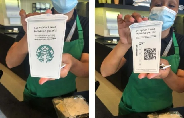
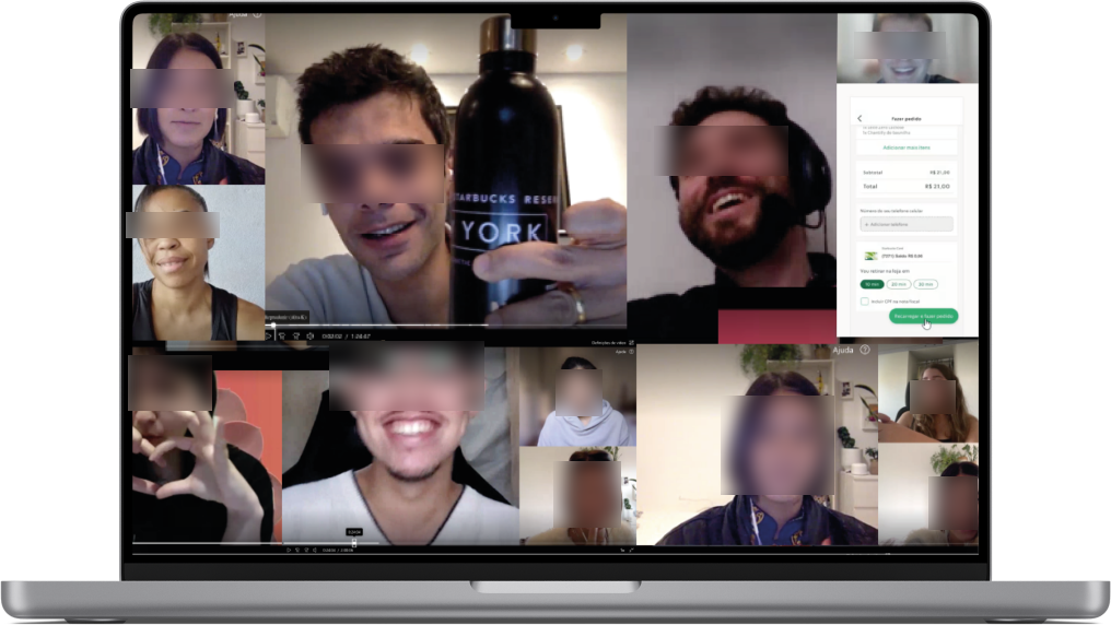
We developed our recruitment strategy with budget constraints in mind, aiming to effectively engage the personas we wanted to explore our key questions. We utilized an online form for initial screening, selecting participants according to their responses. In compliance with privacy laws, we then approached the screened respondents for a round of in-depth interviews resulting in:
4
2k
21
Personas explored
Forms answered
In-depth interviews
Define
We employed affinity mapping to analyze the data collected, identifying patterns in app usage, member frequency, and purchasing behaviors.
Some of the key insights were:
A substantial number of regular customers were not aware of the app’s ability to order ahead
"Every time I buy, it's through the app, I go to the regular service and pay at the cashier. I think I didn't even know that pickup existed. I've never used it.”
Users frequently canceled transactions due to issues with topping up their accounts
"I didn't use it sometimes precisely because of the issue of having to recharge the card. I find it annoying.."
Many consumers used the app primarily to bypass lines
"The last time I went, the line was very long. I went to order through the app and loaded everything and ordered, but the minimum is 10 minutes, so I ordered through the app, but then I ended up thinking if it wouldn't have been better to just wait in line.”
The cumbersome login and password recovery process deterred users from utilizing the app
"I've had login issues a few times, I don't know if it was me or something else. I was at the cashier, there was a line, and I had to stay in line creating a new password. You get kind of nervous, don't you.”
Develop
To foster trust among Starbucks Brazil stakeholders and set our strategic direction, I spearheaded a series of cocreation workshops with design, tech, data, and product teams.
These sessions allowed us to collaboratively establish the project's objectives, initially highlighting each pain point alongside benchmarks from well-known market solutions for similar challenges.
The team contributed to innovative ideas and solutions generating 96 actionable changes to the app, which were prioritized selecting 47 using the Lean Inception process, taking into account the effort required, business value, and user satisfaction for each idea. These changes were then distributed into 16 implementation waves leading to the creation of our product roadmap.
Implemented Changes:
Implementing the first three development waves yielded remarkable results, showcasing the efficacy of the featured changes:
Transparent Top-Up
Optimized top-up amounts matching order values
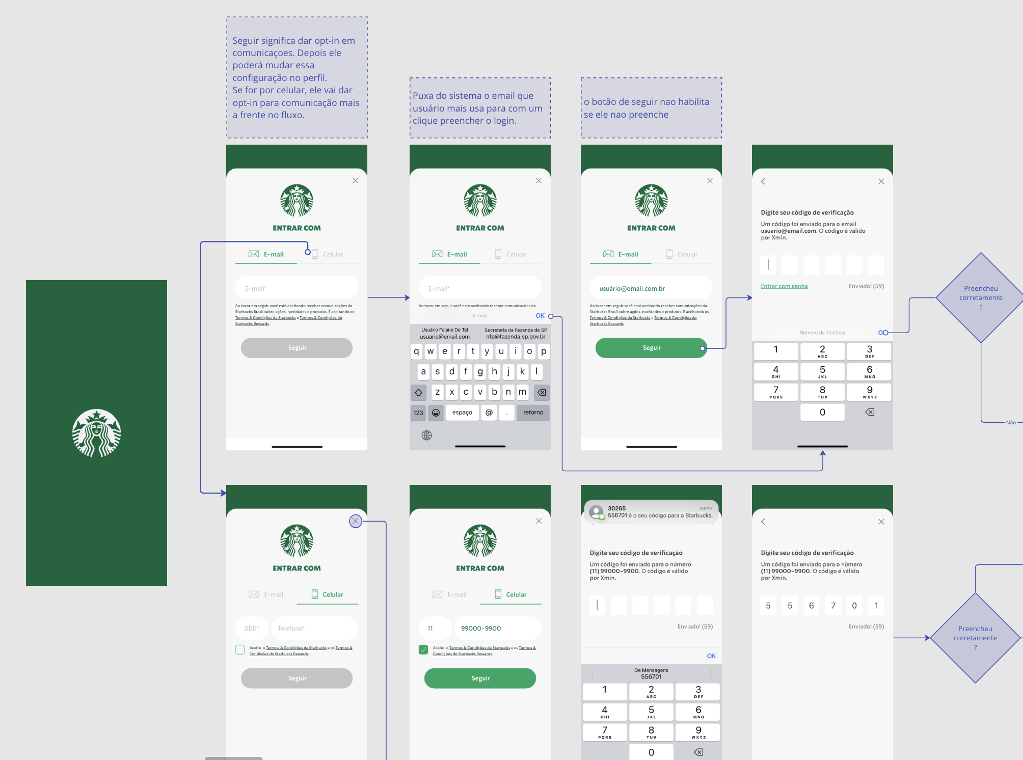
Easy Login
Streamlined 2-step login via email or SMS
"Order Again" section
One-tap reorder from the home screen
"I'm Here" Button
Instant 'now' service for in-shop users, reducing wait times
Results
Sales Impact
+114%
Orders increased from 700K to 1.5M
Transaction Value
+24%
Average pickup order value rose from R$19.30 to R$24
Rating on Apple Store
+81%
The app's rating surged from 2.2 to 4
Rating on Google Store
+45%
Soaring from 3.3 to 4.8
Conclusion
The Starbucks app Brazil redesign project stands as a testament to the power of user-centered design and strategic problem-solving. As the Experience Lead, I guided our team through a comprehensive redesign process that not only addressed the identified issues but also significantly enhanced the app's performance and user satisfaction. This case study reflects my commitment to delivering impactful digital solutions that meet both user needs and business goals.


